|
Getting your Trinity Audio player ready...
|
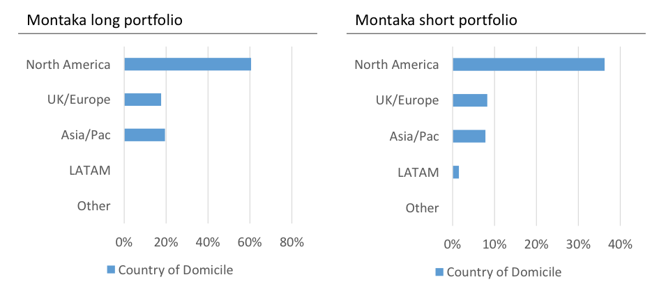
As part of our efforts to promote transparency in Montaka, we publish the following charts each month to give our investors insight into the geographical regions to which their capital is exposed.
The charts below illustrate the percentage of client capital that is exposed to each region in terms of where the underlying businesses are domiciled (as of month-end August 2015). As always, we think of Montaka in terms of two portfolios in parallel, so we find it helpful to illustrate the characteristics of each portfolio separately.
From the charts below, you will immediately notice an outsized share of positions in both portfolios being domiciled in the US. We were recently asked why this was the case.
To help answer this question, take a look at the following chart that was recently tweeted by well-known political scientist, Ian Bremmer. It shows the map of the world, with the size of each country scaled by domestic market capitalization.
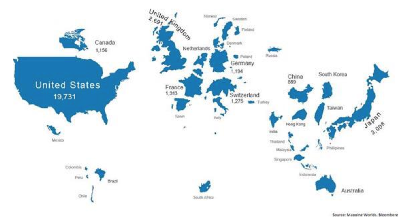
What immediately stands out is the massive size of the US – in terms of market capitalization – versus every other country or region in the world. Given its large share of global aggregate market cap, it should perhaps not be surprising to clients that we naturally find a relatively larger number of opportunities – both long and short – in US domiciled stocks.
![]() Andrew Macken is a Portfolio Manager with Montgomery Global Investment Management. To learn more about Montaka, please call +612 7202 0100.
Andrew Macken is a Portfolio Manager with Montgomery Global Investment Management. To learn more about Montaka, please call +612 7202 0100.