|
Getting your Trinity Audio player ready...
|
In my last post “Downside Protection, Without Upside Reduction” I made the case for long/short global equities funds as a superior investment strategy compared with being fully invested in the broad global equities market over a suitably long horizon. Yet this is at odds with myriad articles in recent years that have chronicled the market’s outperformance over hedge funds since the financial crisis as supporting evidence that the counterpoint is true. With the help of some long run industry data, this addendum should illuminate the empirical value of the long/short equity strategy.
As we saw in the previous post, the value of the long/short strategy lies in its ability to generate an asymmetric reward/risk profile – protecting against market falls and still rising along with markets in positive return periods. In periods when the broader equity market does appreciate strongly, however, the inherent value-add of the long/short strategy may remain unobservable. Therefore, a direct comparison of the performance of the long/short strategy and the market in these times is an inadequate measuring tool. When it comes to considering an allocation to a long/short global equities strategy funded from a global equity portfolio, many investors would mistakenly discard the former for the latter if they only considered the unadjusted returns of the two. Consider the following chart from AQR, a global investment management firm.
Long/short equity hedge fund relative returns (1994-2017)

This chart shows the cumulative returns of an index of long/short equity hedge funds in comparison with: 1) the broader equity market (i.e. fully invested in the index) represented by the red line, 2) a portfolio which is comprised 60% equities and 40% bonds (think of it as around 60% market exposure), and 3) a portfolio that is 46% exposed to the equity market – which corresponds to the regressed beta of the hedge funds over this time period. Let’s talk about these in turn.
As AQR point out it is the downward sloping portion of the red line from 2009 through to today that has likely driven the negative sentiment towards long/short equity hedge funds. But the comparison is nonsensical because it compares fully exposed stock returns to significantly lower (or hedged) returns of the hedge funds, and also because the comparison is made over an isolated period. We can debate whether the time period is long enough to capture the value of the strategy, but away from the temporal debate we should easily agree that this 9-year period has had a solitary character. That is, the period at hand is reflective of the reflation trade, combining reflationary monetary and fiscal stimulus around the world, rather than variabilities of a full and normal cycle independent of the time taken for such cycle to play out.
In short all the red line shows us is “which way the stock market is heading” as AQR puts it. When the market goes up stocks win, when it goes down hedge funds win. Obviously stocks have been going up virtually uninterrupted for a lengthy period now. Long enough that the red line is in negative territory like it was in the late 1990. This is very much meaningless.
The green line is essentially a lower market-exposed version of the red line. Two comments are worth making here. Firstly, with a lower market exposed portfolio as the hurdle the hedge fund portfolio is less handicapped (or benefited) by market direction. Secondly, the value of outperformance (or alpha) is proportionately greater. The sum total is that hedge funds finish the period ahead of the less-exposed portfolio.
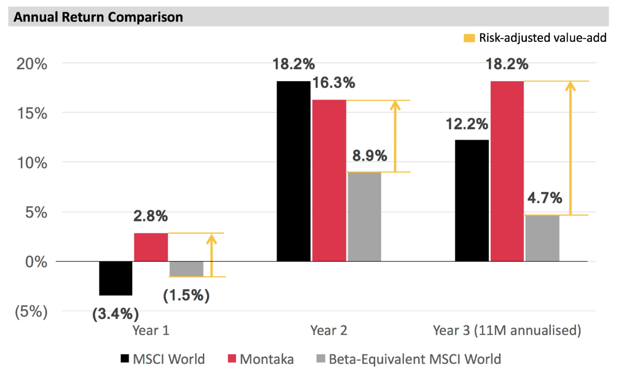
Lastly the blue line shows a “proper comparison”, again as AQR puts it. It is proper in the sense that over the two-decade-plus horizon the blue line compares the returns of hedge funds to a stock portfolio with similar risk (beta of 46%). Remembering, back to my previous post this is the equivalent of the delta between Montaka’s performance shown in red bars and the risk-adjusted market performance shown in the grey bars. I have reproduced the chart again here for your reference.
Source: MGIM
Coming back to the AQR chart, the blue line tells us that the value-add of hedge fund managers has actually been 60%-plus from 1994 to today, as measured against a risk-appropriate benchmark, even though the superficial conclusion projected by the red line may lead a less analytical investor to conclude that hedge funds have detracted 40% of value over the same period.
Moreover, when AQR went on to perform the full statistical regression of monthly hedge fund returns against the market, the following was derived:
ELS = 2.9% + 0.46*MKT, with R^2 = 64%, w
where ELS = the monthly return over cash to equity long/short hedge funds; and MKT is the excess return of the capitalization weighted stock market over cash
This regression equation shows that hedge funds’ returns were not only 46% exposed to the market, but also that the “intercept” is a positive 2.9% annualized. That means that hedge fund returns were not just lower beta but they were also adding significant absolute (non-market) performance, or alpha, over the full sample period.
With proper analysis that covers a longer time period, different market environments, and considers appropriate risk-adjusted return series, we can conclude that long/short equity strategies have empirically added significant value beyond the market’s performance.
![]() Christopher Demasi is a Portfolio Manager with Montaka Global Investments.
Christopher Demasi is a Portfolio Manager with Montaka Global Investments.
To learn more about Montaka, please call +612 7202 0100.